Visual Standard
Shape Type
The core of the Visual Standard is the Shape. The Shape is a visual representation of the role the element has in the system.

| Shape Type | Description |
|---|---|
| Actor | Any external entity (e.g a person, organization or system) that interacts with the Target System, either by consuming services from it or providing services to the it. |
| Target System | A holistic model of the Nodes and Components that together provide the services to the Actor(s). |
| Node | A separately identifiable part of the Target System, with a clear demarcation of the boundary and the function the Node provides. A Node can be deployed and run independently. |
| Component | A separately identifiable part of a Node. A Component is part of - or can run on - a Node but cannot run independently without a Node. |
| Group | A collection of Model Elements. A Group can e.g. be used to identify a security boundary, location, cluster services etc. |
Node, Component and Group are available as Logical and Prescribed Shape Type:
- Logical Element: a conceptual representation of an element e.g. Firewall (Node), Runtime Environment (Component) or Data Center (Group).
- Prescribed Element: a specific representation of an element that has sufficient details so that it can (or already is) deployed e.g. a Juniper MX304 Universal Routing Platform, Nodes.js JavaScript runtime environment or Equinix AM1 Amsterdam IBX® Data Center.
Shape Layout
Most Model Elements are available in 3 different Shape Layouts:
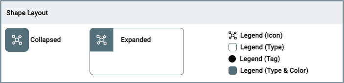
- Collapsed: small representation of the element, without option to show the internal decomposition of the element.
- Expanded: large representation of the element, with the option to show the internal decomposition of the element.
- Legend: tiny representation of (a part of) the visual aspects of the element, in order to create a legend.
Shape Style
The Shape Style is used to alter the lines of the Shape:
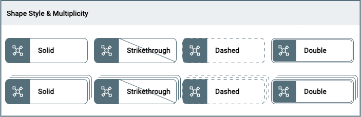
- Solid: single stroke, the default representation of a shape.
- Strikethrough: diagonal line through title and body e.g. used to identify that an element is removed.
- Dashed: single stroke in a dashed pattern e.g. used to identify that an element is not active.
- Double: double stroke e.g. used to identify a none permeable boundary.
In addition to 4 Styles the Shape can be represented as having more then one instance through Multiplicity. It signifies 'more then one' but the amount of strokes (3) does not correspond to the actual amound of instances.
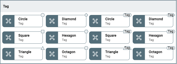
Tag
A Tag can be added to the Shape to add additional information. There are 6 differente Tags (Circle, Square, Triangle, Diamond, Hexagon, Octagon), which can be empty or a text can be added e.g. to distinguish Active from Passive elements:
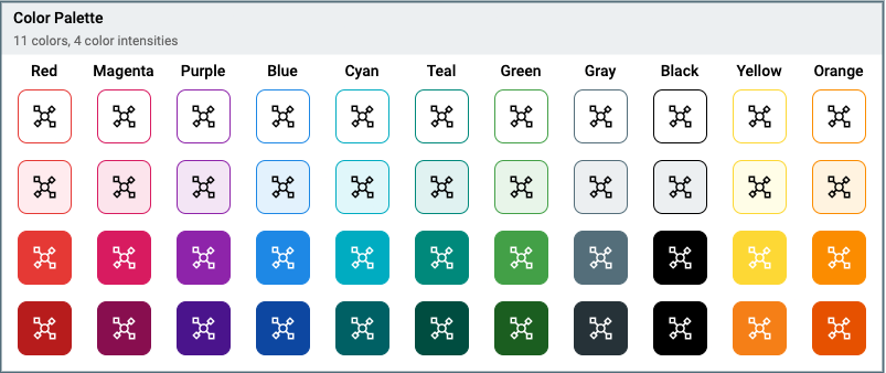
Color
A Shape can be assigned one of 11 colors and for each of the colors there are 4 intensity levels. Colors are selected from the Material Design Color palletes and tested for accessibility:
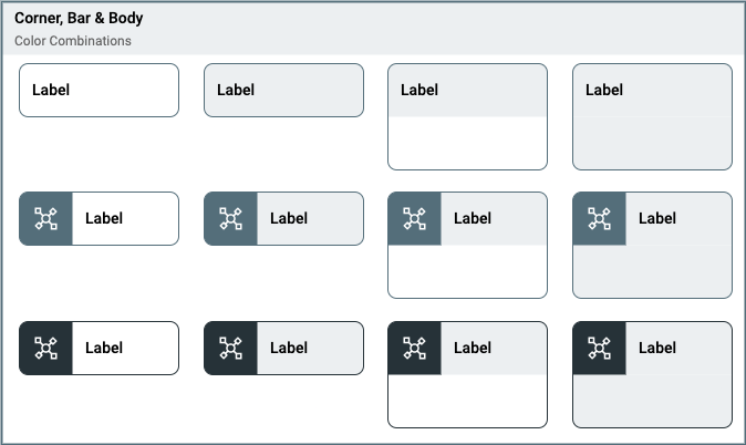
The Corner, Bar, Body & Outline of the Shape can take different appearances:
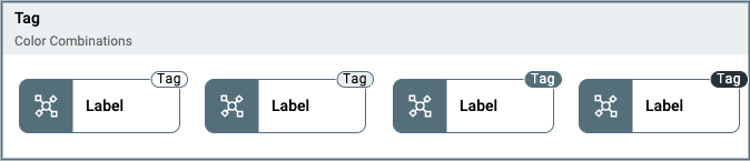
The Tag can be styled using the same color pallette and apperances:
Icon
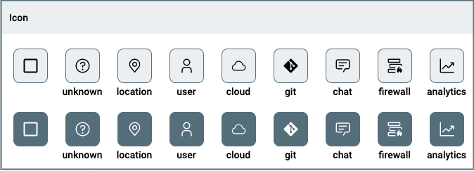
An Icon can be added to the Corner of the Shape. The Icon is white or black depending on the intensity of the background color.